Short on time? TL;DR — Instagram Aspect Ratios in 2026
Instagram killed the square grid in 2025. The platform now previews posts in a 3:4 format (1080 x 1440px), and that changes how you should be designing content.
Here’s what you actually need to know:
- Feed posts: 3:4 (1080 x 1440px) is the new recommended standard. 4:5 (1080 x 1350px) still works and is the safe default. Square and landscape are supported but take up less feed real estate.
- Stories and Reels: 9:16 (1080 x 1920px) — full screen vertical, every time. Keep critical elements away from the top and bottom edges.
- Carousels: Match every slide to the same ratio. 3:4 recommended.
- Ads: Same rules as organic. Leave the top and bottom edges free from text and logos or your CTA gets buried under Instagram’s UI.
- Profile picture: 320 x 320px minimum, displays as a circle — keep everything centered.
- Always upload at 1080px wide. No exceptions.
Full article below:
If you’ve ever uploaded a photo to Instagram and watched it get cropped in a way you didn’t expect — you’re not alone. Getting dimensions wrong on Instagram isn’t just annoying. It can cut off your subject, bury your text, and make an otherwise great piece of content look amateur.
In 2026, this matters more than it used to. Instagram has changed how content displays — both in the feed and on your profile grid. If you’re still designing content the same way you were two or three years ago, you’re probably leaving engagement on the table. This guide breaks down every aspect ratio you need to know, what changed recently, and exactly how to set up your content so it looks sharp everywhere it appears.
This graphic below gives you a quick visual reference.

Why Instagram Dimensions Matter More Than Ever
Wrong Sizes = Cropped Content, Reduced Reach, Lost Engagement
Instagram doesn’t just display your image — it fits it into a container. If your image doesn’t match that container’s expected ratio, the platform crops it automatically. That means faces get cut off. Text disappears. Products get sliced in half.
Beyond the visual problem, there’s a performance problem. Poorly formatted content signals low effort. Audiences scroll past it. The algorithm notices.
Getting dimensions right is one of the easiest wins available to any brand or creator on the platform. It costs nothing. It just requires knowing the numbers.
1080px Wide Is Still the Universal Standard
Across every format — feed posts, Stories, Reels, ads — 1080 pixels wide remains the baseline. Upload lower than that and Instagram scales your image up, which introduces compression and softness. Upload wider and Instagram scales it down.
Start at 1080px wide. Every time.e when planning out demo and explainer video projects.
The Biggest Instagram Change of 2025–2026: The Grid Shift
Instagram Killed the Square Grid
For years, Instagram was synonymous with the square. The 1:1 format defined the platform’s aesthetic and shaped how brands built their visual identity. That era is over.
In 2025, Instagram officially moved away from the square grid preview. This was one of the most significant formatting changes the platform has made in years — and a lot of brands got caught off guard.
The New 3:4 Grid Preview Format (1080 x 1440px) Explained
Your Instagram profile grid no longer previews posts as squares. It now previews them in a 3:4 ratio — meaning taller, more vertical thumbnails at 1080 x 1440px.
If your profile suddenly looked off-balance or weirdly cropped after this change, that’s exactly why. Content designed for a square grid doesn’t always translate cleanly to a taller vertical preview.
What This Means for Your Content Strategy Going Forward
Simple. Stop designing square-first.
The 3:4 format is now the grid-friendly standard. Brands that adapt their templates, their Canva files, their design workflows — they’re going to have cleaner, more intentional-looking profiles. Brands that don’t are going to keep wondering why their grid looks inconsistent.
Instagram Feed Post Aspect Ratios
Portrait / Vertical — 4:5 (1080 x 1350px)
Why This Is Still the Safest Default for Most Brands
The 4:5 vertical format has been the go-to recommendation for years, and it still holds up. It takes up more vertical real estate in the feed than a square, which means more screen space, more visibility, more opportunity to stop the scroll.
It also plays well with the new grid system. A 4:5 post will experience some cropping in the 3:4 grid preview, but if you keep key elements centered, it’s manageable.
For most businesses — especially service-based companies, product brands, and anyone running paid ads — 4:5 remains a safe, reliable default.
Square — 1:1 (1080 x 1080px)
When Square Still Makes Sense
Square isn’t dead. It’s just no longer the default recommendation.
If you have a specific reason to use square — a logo lockup, a graphic that’s designed to be symmetric, or a brand aesthetic that calls for uniform thumbnails — it still works. Just know that you’re giving up vertical space in the feed, and your grid previews will crop accordingly.
Landscape — 1.91:1 (1080 x 566px)
Best Use Cases for Wide / Cinematic Shots
Landscape is the smallest format in terms of feed real estate. It takes up the least vertical space, which means it’s easier to scroll past.
That said, there are legitimate use cases. Wide product shots. Architectural photography. Cinematic brand content where the horizontal framing is part of the visual story. If the shot demands it, use it — just go in understanding the tradeoff.
Tall — 3:4 (1080 x 1440px) — New for 2026
Why This Format Is Now Recommended for Most Feed Posts
This is the new recommendation. The 3:4 format aligns with Instagram’s updated grid preview, which means your feed posts and your grid thumbnails are finally working together instead of fighting each other.
It also maximizes vertical space in the feed — more than 4:5, more than square, more than landscape. More screen space means more attention. For brands prioritizing organic reach and engagement, this is the format to start building around.
Instagram’s Supported Aspect Ratio Range: 1.91:1 to 4:5
Instagram accepts anything between 1.91:1 (landscape) and 4:5 (portrait) for feed posts. Upload something outside that range and the platform auto-crops it to fit. That’s where things go wrong.
Instagram Stories Aspect Ratio and Dimensions
Correct Size: 9:16 — 1080 x 1920px
Stories are full-screen vertical. The standard is 9:16 at 1080 x 1920px, and that hasn’t changed. Design your Stories content at this size from the start — don’t try to adapt a feed post after the fact. It almost never looks right.
The Stories Safe Zone Explained (1080 x 1610px)
Here’s what a lot of people miss. Even though your Story canvas is 1080 x 1920px, Instagram’s UI elements — profile info at the top, response bar at the bottom — overlap your content.
The safe zone is roughly 1080 x 1610px in the center of the frame. Keep any text, logos, calls to action, or critical visual elements inside that zone. Anything too close to the top or bottom edges risks getting covered.
What Gets Cut Off and How to Avoid It
The top ~155px and bottom ~155px of your Story are the danger zones. That’s where Instagram’s interface lives. Put your CTA there and nobody sees it. Design from the center out. Leave breathing room at the edges. It’s a simple habit that makes a real difference.
Instagram Reels Aspect Ratio and Dimensions
Correct Size: 9:16 — 1080 x 1920px
Same as Stories. Reels are full-screen vertical content at 9:16, 1080 x 1920px. This is the format the platform is built around right now. It’s where Instagram is pushing creators and brands. Design for it natively.
How Reels Display Differently in Feed vs. Grid (3:4 Crop)
This is where it gets a little nuanced. While Reels play at 9:16 full-screen, they display as a 3:4 crop (1080 x 1440px) in the profile grid.
What that means practically: if your Reel has a title card, a key visual, or text that’s positioned near the very top or bottom of the frame, it may get cut off in the grid preview. Keep the most important elements in the center third of your vertical canvas.
Length Matters — Why Reels Over 3 Minutes Lose Algorithmic Reach
Instagram has been clear about this. Reels over 3 minutes exist, but they won’t be pushed to new audiences. The algorithm deprioritizes longer content for discovery.
If reach is the goal — and for most brands it is — keep Reels under 3 minutes. Under 60 seconds tends to perform even better for completion rate, which is a signal the algorithm responds to.
Instagram Carousel Post Dimensions
Match All Slides to the Same Aspect Ratio
This is non-negotiable. If your first slide is 4:5 and your second slide is 1:1, Instagram crops the second slide to match the first. The result is inconsistent framing, awkward crops, and a carousel that looks unpolished.
Pick your ratio before you design. Build every slide to match.
Recommended Format for Carousels in 2026: 3:4
For the same reasons the 3:4 format works for single posts, it works for carousels. Maximum vertical space, grid-friendly previews, and the cleanest look across both feed and profile.
Why Inconsistent Ratios Break the Carousel Experience
Carousels are one of the highest-engagement formats on Instagram right now. They reward thoughtful design. Inconsistent dimensions are one of the fastest ways to undercut that — especially when a viewer swipes and the visual suddenly shifts, jumps, or crops unexpectedly.
Instagram Profile Picture Size
Upload Size: 320 x 320px Minimum
Instagram stores profile photos at 320 x 320px. Upload smaller than that and the platform scales it up — which means compression, softness, and a profile image that looks blurry next to everyone else’s.
Upload at 320 x 320px minimum. If you want to future-proof it, go up to 1080 x 1080px. Instagram will scale it down cleanly.
Displayed as a Circle — What That Means for Your Design
Your profile photo is cropped into a circle on display. That square image you upload? The corners get cut.
Anything important — a logo, a face, a graphic element — needs to be centered. Give yourself padding around the edges. Test how it looks at small sizes, because that’s how most people will actually see it.
Pro Tips for Logos vs. Headshots
For logos: use a version with breathing room around it. A logo that fills the entire square will get the edges clipped by the circular crop. Leave margin.
For headshots: crop tight to the face. Small profile photos don’t have room for a lot of background. Get the face large and centered and it’ll read clearly even at thumbnail size.
Instagram Ad Aspect Ratios and Dimensions
Feed Image and Video Ads
Supported Formats: 3:4, 4:5, 1:1, 1.91:1
Instagram feed ads follow the same dimensional rules as organic posts. All four major aspect ratios are supported. The 3:4 and 4:5 vertical formats tend to perform strongest for most ad objectives because they take up more screen space — more screen space means more attention before the scroll.
For video ads in the feed, match your video dimensions to the same ratio guidelines. For vertical video, 3:4 or 4:5. For landscape, 1.91:1.
Stories and Reels Ads
Full-Screen Vertical: 9:16 — 1080 x 1920px
Stories and Reels ads run full-screen. The correct size is 9:16 at 1080 x 1920px. This is immersive, mobile-first, and when executed well — extremely effective.
For maximum quality in ad placements, some sources recommend uploading at 1440 x 2560px and letting Instagram scale down. Either way, start with a 9:16 canvas.
Safe Zones for Text and Logos in Ad Placements
This matters even more in paid placements than in organic content. Instagram’s interface overlays the top and bottom of Stories and Reels ads. Meta recommends keeping roughly the top 14% and bottom 20-35% of the frame free from any text, logos, or calls to action.
That’s not a suggestion. Ignore it and your CTA gets buried under the UI. Your ad spend goes to waste.
Carousel Ads
Keep All Frames at the Same Ratio
Same rule as organic carousels. Every frame needs to match. Inconsistent ratios in paid carousel ads look sloppy and can affect delivery.
3:4 Recommended for 2026 Campaigns
For carousel ads running in 2026, the 3:4 format gives you the most vertical space and the cleanest look across placements. If you’re building new ad creative from scratch, start here.
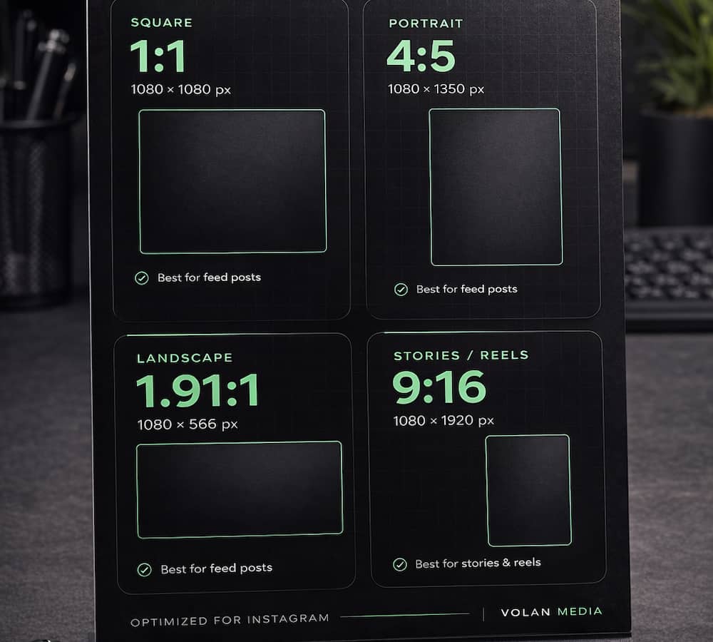
Quick Reference — Instagram Aspect Ratios at a Glance
Feed Posts
- Square: 1:1 — 1080 x 1080px
- Portrait: 4:5 — 1080 x 1350px
- Landscape: 1.91:1 — 1080 x 566px
- Tall (recommended 2026): 3:4 — 1080 x 1440px
Stories and Reels
- Both: 9:16 — 1080 x 1920px
- Safe zone: keep critical content centered, away from top and bottom edges
Ads
- Feed ads: same as organic (3:4, 4:5, 1:1, or 1.91:1)
- Stories/Reels ads: 9:16 — 1080 x 1920px
- Leave top and bottom edges free from text and logos
Profile Picture
- Upload: 320 x 320px minimum
- Displays as a circle — keep key elements centered.
Pro Tips for Getting Instagram Dimensions Right Every Time
Always Upload at 1080px Wide Minimum
This is the baseline. Below 1080px wide and you’re letting compression do damage to your content before it even reaches your audience. Set 1080px as the floor. Non-negotiable.
Export Format — JPG for Photos, PNG for Graphics
JPG compresses better for photography and produces smaller file sizes without significant quality loss. PNG preserves sharp edges and clean lines, which matters for logos, text-heavy graphics, and anything with solid color blocks.
Use the right format for the right content type. It’s a small thing that adds up.
Keep Critical Elements Centered in Every Format
Every Instagram format crops from the edges. The center of your frame is the safest real estate on the platform. Text, faces, logos, calls to action — if it matters, it belongs in the center.
This is especially important for content that gets repurposed across multiple formats. Design centered from the start and your content adapts more cleanly to every placement.
The “Raw Content” Shift — Why Correct Dimensions Still Matter
Instagram’s own leadership has talked publicly about a shift toward authentic, less polished content. More real. Less produced. And there’s truth to it — audiences are responding more to genuine content than perfectly lit brand shoots.
But here’s what that doesn’t mean. It doesn’t mean sloppy. It doesn’t mean wrong dimensions and awkward crops and blurry profile photos.
Raw content and correct dimensions aren’t in conflict. You can post authentically AND format it correctly. One is about tone. The other is about technical execution. Get both right.
Video outperforms images — by a lot Video content generates 21.2% higher engagement than static images on Instagram. SQ Magazine(Source: SQ Magazine / Instagram Statistics 2026)
Frequently Asked Questions About Volan Media
What does Volan Media do? Volan Media is a full-service video production and content marketing company based in the Knoxville and Oak Ridge area. We produce commercial video, animated explainer videos, digital ad campaigns, brand films, product and technology videos, and motion graphics for businesses across East Tennessee and nationwide.
Where is Volan Media located? We’re based in the Knoxville, Tennessee area and work extensively throughout East Tennessee — including Oak Ridge, Maryville, and the broader region. We also work with clients across the country and internationally.
What industries does Volan Media work with? We’ve produced content across a wide range of industries including healthcare, advanced manufacturing, energy and engineering, SaaS and technology, professional services, automotive, tourism, retail, and industrial and logistics. If your business needs to communicate clearly and compete for attention, we can help.
Does Volan Media produce animated explainer videos? Yes — and it’s one of our strongest capabilities. We produce 2D animation, 3D animation, motion graphics, and hybrid live-action/animation videos fully in-house. That means tighter timelines, better creative control, and higher quality output than studios that outsource animation work.
Can Volan Media help startups? Absolutely. We’ve worked with startups at every stage — from solo founders with a landing page and a pitch deck to companies with hundreds of employees scaling nationally. Demo videos, investor pitch content, product explainers — we understand what early-stage companies need and how to execute it efficiently.
How much does a video production project cost? Every project is scoped individually based on complexity, locations, crew size, animation requirements, and deliverables. As a general reference for the Knoxville and Oak Ridge market:
- Lean single-location production: $5,000–$10,000
- Full professional crew with multiple setups: $10,000–$20,000
- Premium multi-day production with advanced animation: $20,000–$40,000+
Every proposal is transparent. Clear scope, clear deliverables, no hidden fees.
What makes Volan Media different from other Knoxville video production companies? A few things. We approach every project through a marketing and performance lens — not just a production lens. Creative decisions are tied to business objectives. We also have over 12 ADDY awards for video production, which reflects a consistent standard of quality. And because we execute 2D animation, 3D animation, motion graphics, and live-action production entirely in-house, we have creative and quality control that most regional studios can’t match.
Does Volan Media handle digital distribution and paid media strategy? Yes. Production without strategy is just expensive content. We work with clients to develop platform-specific video content optimized for YouTube, LinkedIn, Instagram, Facebook, and streaming placements — with performance marketing objectives built in from the start.
How do I get started with Volan Media? The easiest way is to schedule a free 30-minute call. We’ll talk through your goals, your audience, where the content will live, and what kind of production makes sense for your budget. No pressure, no pitch — just a straightforward conversation about what you’re trying to accomplish.
Schedule a call: https://calendly.com/volanmedia/30min
Other Related links:
Industries